🌅 A new front door — and an invitation to help shape it
This update is a continuation of #🗺️ The Realms are back — and this time we made a map. If you missed that one, start there — this picks up the thread.)
A little while ago I shared the realms map and said the realms were back for good. What I didn't say out loud yet is that the map was the first move in something bigger: a slow re-dressing of the whole of Grokkist so that the way it looks finally matches the way it works.
This post is me thinking out loud about that — the new landing page, the design system underneath it, and the reasons behind the choices. And then, near the end, a genuine ask: I want your eyes and your gut reactions on the words. More on that below.
Why redesign anything at all?
The main Grokkist website’s front page was last updated in October 2024. It wasn’t broken, but it was in need of a refresh. That’s largely because it was describing Grokkist from the outside — telling you it was a community, a place to learn, a publication. All true, all a bit flat. None of it carried the feeling of the place: the threshold energy, the sense that you've wandered somewhere slightly enchanted but still grounded enough to take seriously.
So the brief I set was unusual. Not "make it look modern" or "make it convert." It was closer to: build a front door that the right person recognises themselves in before they've read a single full sentence. Grokkist works on the Ratatouille principle — it’s not for everyone, but it could be for anyone — so the design can't assume a demographic. It can only signal a way of being: curious, caring, a little out of step, paying more attention than gets named.
That's a strange thing to ask a colour palette and a typeface to do. But that's the job.
The design system: structural metaphors, made visible
Here's the part I find most fun. The refreshed visual language is grounded in the structural metaphors we already use to describe what Grokkist actually is.
It’s built in three layers, used roughly 80% ground, 15% biome, 5% signal.
Layer 1 — the Ground (the dominant 80%). The canvas everything sits on. Not one colour — a family that comes in three moods. A paper mood (daytime) — warm creams, bone, sand — for cozy, long-form reading, where most of the site actually lives. A deep mood (evening) for atmospheric, immersive moments based in forest green and teal. And aubergine — the one on this new landing page — is reserved for threshold / portal pages. If the landing page feels more purple and dusk-lit than the rest of the site, that’s deliberate: it’s an enchanted doorway, not a living room.
Layer 2 — the Biome (15%). Natural mid-tones — moss, sage, ochre, clay, rust — that set section moods without shouting. (Ochre is our action colour inside the Network.)
Layer 3 — the Signal (5%). The bright, canonical spark colours from our original 2021 brand guide — each realm carries a signal colour, so colour means something.
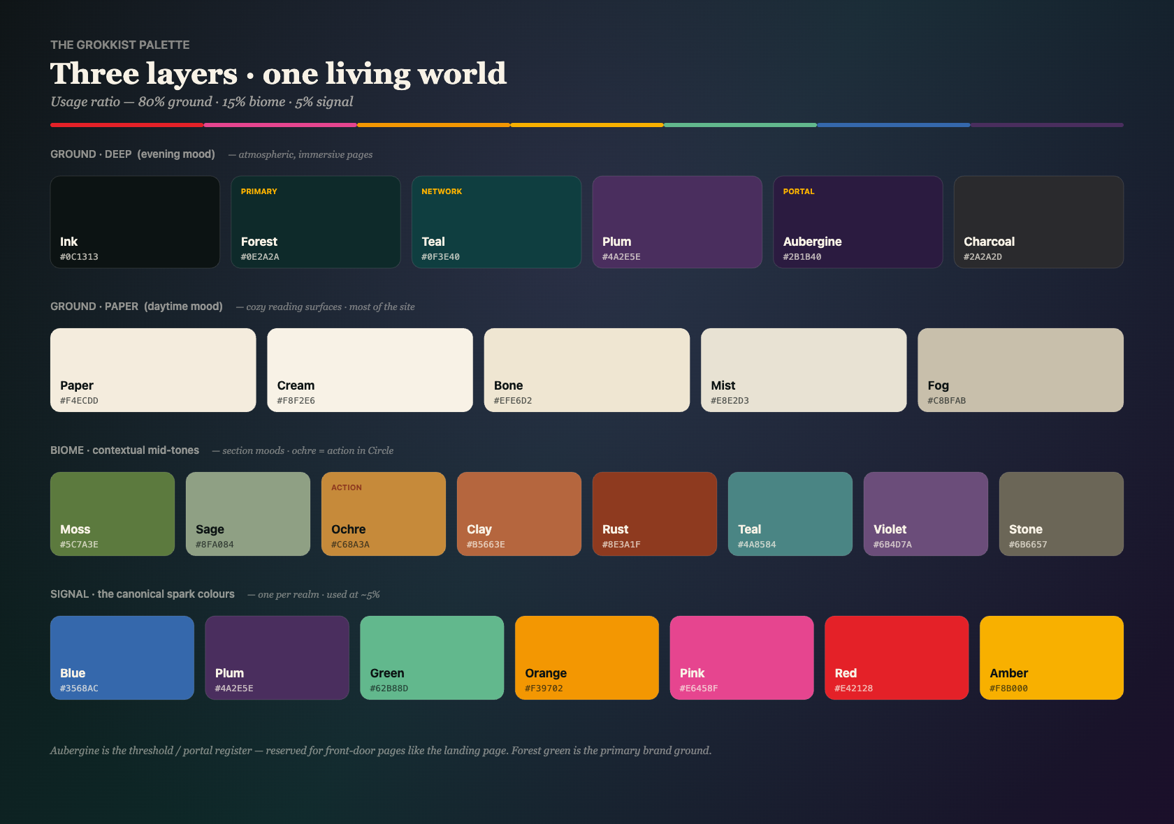
Tying it together: a single amber for emphasis, a thin rainbow rule used as a spine, and the type — Radikal for structure, Cormorant Garamond for the reflective voice. One coherent world, dressed differently depending on whether you’re at a threshold, in the reading room, or out exploring a realm.
The landing page: what it’s trying to do, and how
The page is built to be walked through, not scanned. It opens above the fold with a typewriter line and a quiet instruction — scroll to wander — because the first thing I want you to feel is permission to explore, not pressure to act.
From there it moves in chapters through recognition → what kind of place this is → the geography of the realms → what it feels like to be here → ways in. Each chapter has a small ambient motif rather than a stock photo — a magic-circle of drifting motes you can nudge with your cursor; an unfolding koru — there to do the work of a thousand words.
Three things that make it different from the old one
A new look and feel — the aubergine-and-signal world, so the atmosphere arrives before the argument does.
It’s navigable, with an organising principle true to the place — the realms aren’t just for decoration; they’re how the whole ecosystem (community, events, the Press, courses, groksmithing) is held together. The page gives you a geography of attention to move through, and links straight into the new interactive map.
Brand-new copy — a higher-resolution version of the same ideas — yet another slightly more refined pass at saying what this place is, now that I understand it a little better than I did last year. Same red thread; sharper focus.
The invitation: this is where you come in
Here’s the thing about writing a welcome for a place like this. Everyone here is, almost by definition, a category of one. So the central design problem is genuinely hard: how do you find the language that connects across very different people, when the whole premise is that no two of you are the same and wouldn’t wish to be?
It’s a formidable language task and not something for one person. This is your community, and it should sound like it. So when you have a moment to reflect, please go read the new landing page, and tell me:
Which lines made you feel seen — “yes, that’s me / that’s us”?
Which lines felt off — too much, too clever, not quite you, or just confusing?
Where did you have to read twice? (Usually my problem, not yours.)
Is there anything that would make the wrong person feel more welcome than the right one?
The more specific the better. “The second paragraph of Chapter 1” beats “I liked it.” Quote the exact phrase. Disagreements are gold — if two of you react in opposite ways to the same line, that tells me where the real design tension lives.
A small window into the product-manager side of this: a landing page isn’t trying to please everyone (that road leads to beige). It’s trying to be maximally legible to the people it’s for and gently self-selecting for everyone else — warm, never exclusive, but honest about its own frequency. Your ongoing feedback is how I continually tune that frequency without flattening it.
One last note on how this got made
A bit of behind-the-scenes. (Some of you may know that in my 20s I used to run a small brand and design consultancy, and the way this world has changed since those days is wild and continues to astound me as I try to keep pace with the shifting ground by throwing myself into it.)
Most of this — the landing page, the realms map, the design system — was built conversationally, working with Claude Design as a kind of tireless design collaborator: I describe the feeling and the structural metaphor, we sketch directions, I react, we refine, repeat. It collapses the distance between “having a thought about what Grokkist is” and “seeing it rendered as a working page” down to about a conversation. Which, fittingly, is very on-brand: meaning emerging sideways, through dialogue.
That’s also why your feedback can move so fast now. If a line or an aspect of the design isn’t landing, changing it is no longer a project — it’s a sentence. Which feels like a small kind of freedom, and one I don’t take for granted.
I hope you like the refreshed design language, and thank you, as ever, for being the kind of people who’ll actually read to the bottom of something like this.
— Danu
👉 Read the new landing page · 🗺️ Wander the realms map · then drop your notes in the comments.